What PIRO stands for.
PIRO helps jewelry manufacturers, retailers, wholesalers, and growing jewelry businesses run with more control, better visibility, and less manual work — not just software, but a complete business solution.
Brand promise
Moving jewelry businesses forward.
Who PIRO serves
Jewelry manufacturers, retailers, wholesalers, and growing jewelry businesses.
Brand personality
Clear, practical, reliable, modern, expert, supportive.
Main slogan
Moving jewelry businesses forward.
One master brand. Two product brands.
PIRO Fusion and PIRO Retail are official product brands within the PIRO ecosystem. They use the same core visual system, typography and color palette, while serving different business contexts.
The master / company brand. Used for everything that represents PIRO as a whole.
Official product brand. Used only in Fusion-specific product communication.
Official product brand. Used only in Retail-specific product communication.
Only these three brand levels exist. Features and tools inside the products (such as portal capabilities or commission tools) are described in writing as product features — never as standalone brands, logos or wordmarks.
The PIRO logo system.
The PIRO identity was refreshed in 2025. The system is built around a bold geometric icon and the uppercase PIRO wordmark. At the heart of the icon is a sparkle — a symbol of brilliance, craftsmanship and creative ambition in jewelry. Rather than following a conventional tech-led visual language, the logo was intentionally designed to feel more design-oriented, refined and expressive, reflecting the creativity jewelry businesses are proud to bring to every piece. Always use the current PIRO logo — never older lowercase, flame-based or stretched versions.

The white logo is strongly recommended in exactly two cases: on a Fusion Navy background and on a PIRO Red background. Always use this version there — never the primary red logo.

Keep clear space around the logo equal to the height of the icon. This protects readability and keeps the logo from feeling crowded.

- Digital minimum
Do not use the full logo smaller than 80px wide.
- Print minimum
Do not use the full logo smaller than 20mm wide.
- Very small spaces
Use the icon-only version instead of forcing the full wordmark.
Correct PIRO logo use
- Use the approved PIRO master logo.
- Use the full-color version on light backgrounds.
- Use the white version on dark navy or high-contrast backgrounds.
- Keep logo proportions unchanged.
- Respect clear space at all times.
- Use the icon-only logo only where PIRO is already recognisable.
Incorrect PIRO logo use
- Do not use old lowercase or flame-based PIRO logos.
- Do not stretch, compress, rotate or distort the logo.
- Do not recolor the logo.
- Do not add shadows, outlines, gradients or effects.
- Do not rebuild the logo using typed text.
- Do not place the logo on busy or low-contrast backgrounds.
The PIRO Fusion logo system.
PIRO Fusion uses two approved logo types: the PIRO Fusion Master Lockup and the Fusion Product Mark. Each logo has approved applications for light backgrounds and PIRO Red backgrounds. Always use the supplied logo files without alteration.
PIRO Fusion Master Lockup
Endorsed lockup


Choose the Master Lockup when PIRO endorsement needs to be visible. Choose the Fusion Product Mark in dedicated Fusion contexts where the product is already clearly established.
- PIRO Red is an approved logo background — always use the reversed asset.
- Reversed assets may be used on other strong, high-contrast approved backgrounds when the correct approved file is available.
- Never place the regular red-and-gray logo on PIRO Red.
Keep clear space around the lockup equal to the height of the PIRO icon. Nothing should crowd the PIRO Fusion mark.

- Digital
Do not use smaller than 100px wide.
- Print
Do not use smaller than 25mm wide.
- Very small spaces
Use the Fusion Product Mark — never break the Master Lockup apart.
- Communicating specifically about Fusion.
- Fusion product pages.
- Fusion demo decks.
- Fusion campaigns.
- Fusion customer stories.
- Fusion-specific social media or sales materials.
Correct use
- Use the official PIRO Fusion logo as one complete approved lockup.
- Keep the PIRO name and Fusion name together.
- Use only the approved color and reversed variations.
- Keep the same visual relationship to the PIRO master brand.
Incorrect use
- Do not use “Fusion” alone, without PIRO.
- Do not separate the PIRO icon from the Fusion wordmark.
- Do not stretch, recolor or add effects to the lockup.
- Do not create new product lockups or sub-variants.
- Do not make PIRO Fusion look like an independent company.
The PIRO Retail logo system.
PIRO Retail uses two approved logo types: the PIRO Retail Master Lockup and the Retail Product Mark. Each logo has approved applications for light backgrounds and PIRO Red backgrounds. Always use the supplied logo files without alteration.
PIRO Retail Master Lockup
Endorsed lockup











Choose the Master Lockup when PIRO endorsement needs to be visible. Choose the Retail Product Mark in dedicated Retail contexts where the product is already clearly established.
- PIRO Red is an approved logo background — always use the reversed asset.
- Reversed assets may be used on other strong, high-contrast approved backgrounds when the correct approved file is available.
- Never place the regular red-and-gray logo on PIRO Red.
Keep clear space around the lockup equal to the height of the PIRO icon. Nothing should crowd the PIRO Retail mark.

- Digital
Do not use smaller than 100px wide.
- Print
Do not use smaller than 25mm wide.
- Very small spaces
Use the Retail Product Mark — never break the Master Lockup apart.
- Communicating specifically about Retail.
- Retail product pages.
- Retail demo decks.
- Retail POS campaigns.
- Retail customer stories.
- Retail-specific social media or sales materials.
Correct use
- Use the official PIRO Retail logo as one complete approved lockup.
- Keep the PIRO name and Retail name together.
- Use only the approved color and reversed variations.
- Keep the same visual relationship to the PIRO master brand.
Incorrect use
- Do not use “Retail” alone, without PIRO.
- Do not separate the PIRO icon from the Retail wordmark.
- Do not stretch, recolor or add effects to the lockup.
- Do not create new product lockups or sub-variants.
- Do not make PIRO Retail look like an independent company.
- Do not create standalone logos for features like Portal, SPIFF or other tools.

Use the PIRO Retail favicon in browser tabs, bookmarks, app icons and small UI placements. The icon keeps the hexagon + sparkle shape in the approved Retail color treatment.
Internal & branded tools.
Beyond the core products, PIRO builds a range of internal tools and platforms that follow the same visual identity system. These branded tools reuse the PIRO icon and wordmark, paired with a secondary name to indicate their specific purpose. They are not standalone brands — they always live under the PIRO umbrella.
Customer portal for PIRO clients — order tracking, communication, and account management.
Internal sales incentive and performance tracking tool used across the PIRO team.
Internal AI assistant used by the PIRO team for productivity and knowledge tasks.
- Always use the approved lockup — PIRO icon + wordmark + tool name.
- Keep the visual system identical to the master brand.
- Do not treat these as independent brands with their own identity.
- Do not create new branded tool lockups without brand team approval.
Favicons across platforms.
Each PIRO platform uses a distinct favicon variant to help users visually distinguish between products in browser tabs, bookmarks, and app icons. All favicons share the same hexagon + sparkle shape — only the color treatment changes.

The primary red hexagon with the white sparkle. Used in PIRO Fusion and across the marketing site gopiro.com.
Red outlined hexagon with the PIRO sparkle in red. Used inside the PIRO Retail application for browser tabs, bookmarks, and app icons.

Navy blue hexagon with a white sparkle. Used for the PIRO Customer Portal to signal the client-facing environment.

The AI helper icon — red and navy hexagon with the PIRO sparkle. Used across the website, PIRO Fusion, PIRO Retail and Support to identify AI-powered features and the AI assistant.


Red hexagon with the PIRO sparkle held inside an orbit of four connected points — the symbol for relationships kept in motion. PIRO Clienteling helps jewelry sales teams capture customer preferences, wishlists and milestones, then follow up at the right moment, so every client feels personally known. Use this favicon inside the Clienteling app and on its dedicated product pages.

Never mix favicons across platforms — each product uses its assigned variant.
Always export at multiple sizes (16, 32, 48, 180, 512) for full device support.
Keep the hexagon shape intact. Never crop, recolor, or replace the sparkle.
Which PIRO brand should I use?
Choose the brand based on the scope of the communication. Use PIRO for company-wide communication. Use PIRO Fusion or PIRO Retail only when the message is clearly about that specific product.
PIRO
Use PIRO when the communication represents the company, the overall PIRO ecosystem or more than one product.
PIRO Fusion
Use PIRO Fusion when the message is specifically about Fusion, manufacturing workflows or operational processes.
PIRO Retail
Use PIRO Retail when the message is specifically about Retail, POS or jewelry-store workflows.
Talking about the business as a whole?
Use PIRO.
Talking about one specific product?
Use PIRO Fusion or PIRO Retail.
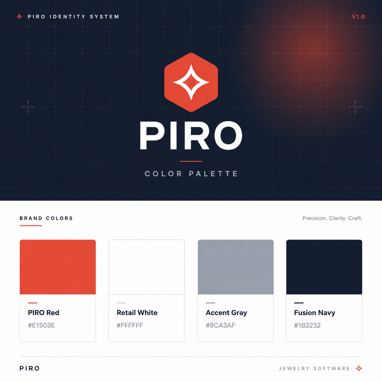
A confident, balanced palette.
PIRO Red leads. Fusion Navy grounds. White breathes. Accent Gray supports. The same palette applies across PIRO, PIRO Fusion and PIRO Retail.
Primary brand color, highlights, buttons, accents, callouts.
Main background, clean layouts, negative space.
Secondary text, borders, subtle backgrounds, interface details.
Headings, dark sections, premium contrast, footer, hero accents.
Inter, used with discipline.
One typeface, used at clear, deliberate sizes. Bold for headlines, medium for section titles, regular for body.
Moving jewelry businesses forward.
Moving jewelry businesses forward.
Moving jewelry businesses forward.
Moving jewelry businesses forward — with one connected system for sales, inventory, production, CRM and operations.
Rules
- • Use Inter only.
- • Keep layouts spacious and readable.
- • Bold for headlines, medium for section titles, regular for body.
- • Avoid too many weights on the same design.
Don't
- • Don't use Segoe UI as the primary brand font.
- • Don't mix serif fonts into product or marketing.
- • Don't stretch, condense or outline letters.
Talk about outcomes, not modules.
PIRO communicates benefits before features, avoids jargon, and positions itself as a solution partner. The word ‘software’ stays where it supports clarity, SEO and search intent.
- Gain better visibility over your jewelry business.
- Reduce manual work across sales, production, inventory and customer management.
- Keep your team aligned with one connected system.
- Move your jewelry business forward with smarter processes.
- Overly technical module descriptions without business value.
- Generic software claims with no clear benefit.
- Jargon-heavy explanations.
- Positioning PIRO as just another ERP system.
Eight rules that shape every PIRO sentence.
Lead with outcomes — keep “software” where it earns clarity.
Use when:
- Creating social media posts
- Writing awareness content
- Explaining PIRO to new audiences
- Creating trade show messaging
- Presenting PIRO as a strategic solution
Use when:
- Writing SEO landing pages
- Creating Google Ads content
- Describing product categories
- Targeting search terms like jewelry software, POS, ERP, inventory
- Comparing PIRO with other business management systems
Translate features into business value.
Reusable brand messages.
Moving jewelry businesses forward.
PIRO helps jewelry businesses manage sales, inventory, production, CRM and operations in one connected system.
- Jewelry software built for growing businesses.
- More control. Less manual work. Better visibility.
- A smarter way to manage jewelry operations.
- Built for the way jewelry businesses actually work.
A simple structure for every PIRO message.
Disconnected sales, production, and inventory processes One connected jewelry business system Better visibility, fewer mistakes, and smoother daily operations.
Lead with the value, not the feature.
Every PIRO message should map back to one of these four pillars.
Transparency
Help jewelers see what is happening across orders, inventory, production, repairs, sales, and customer communication.
Efficiency
Reduce manual work, duplicated data entry, disconnected spreadsheets, and unnecessary back-and-forth communication.
Productivity
Help teams work faster, stay aligned, and complete more work with fewer errors.
Profitability
Support better decisions, better visibility, smoother operations, and more scalable business growth.
Increase perceived value by showing all four sides.
PIRO helps jewelry businesses gain visibility and control across their entire operation through one jewelry-specific system — helping teams reduce manual work, adopt faster, and move the business forward with more confidence.
Desired outcome
Visibility and control across the entire jewelry business.
Higher likelihood of success
A jewelry-specific system built around real jewelry workflows.
Faster time to value
A guided setup helps teams reach operational clarity faster.
Lower effort and sacrifice
Less manual work, less complexity, and smoother adoption.
Clean, structured, premium.
Generous white space, simple geometry, rounded cards, subtle gray borders, PIRO Red accents and Fusion Navy typography.
Clarity
Consistency
Simplicity
Premium SaaS feel
Business relevance
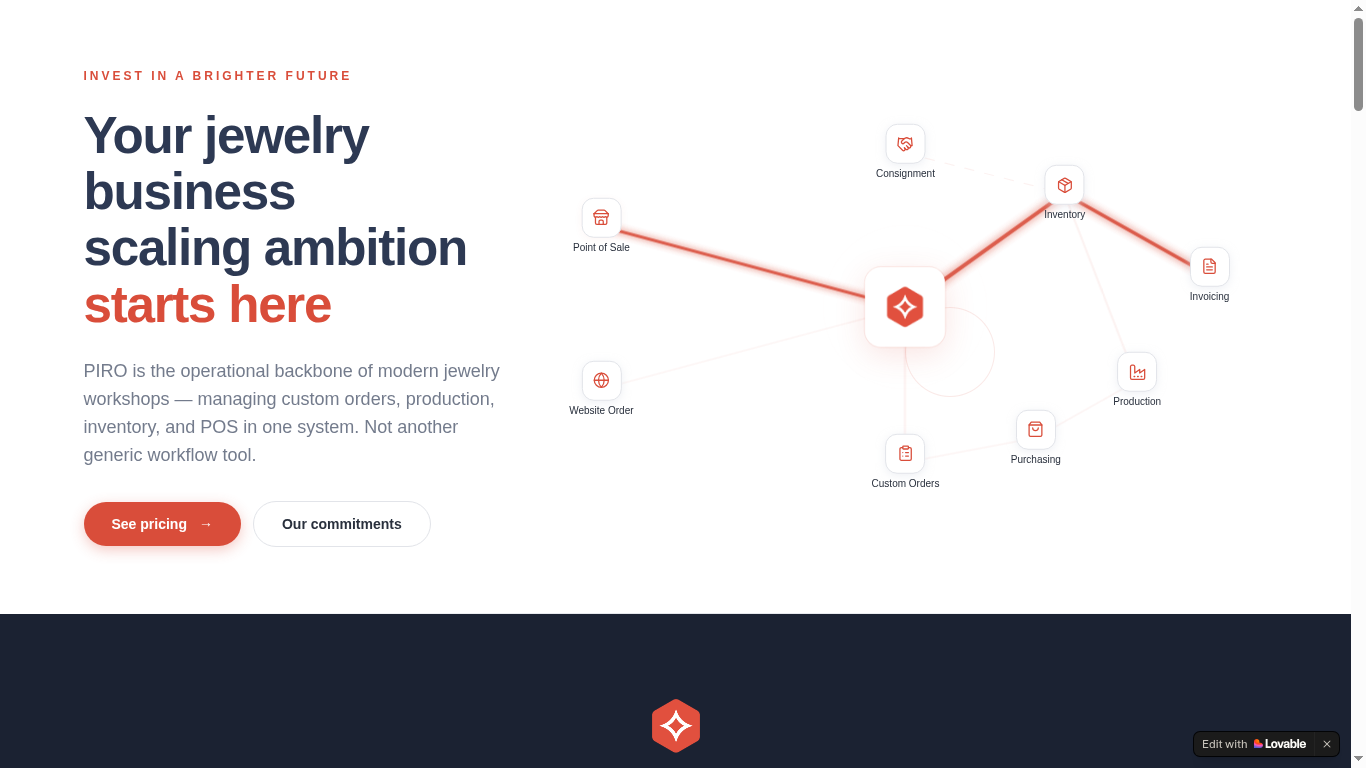
Brand in the wild.
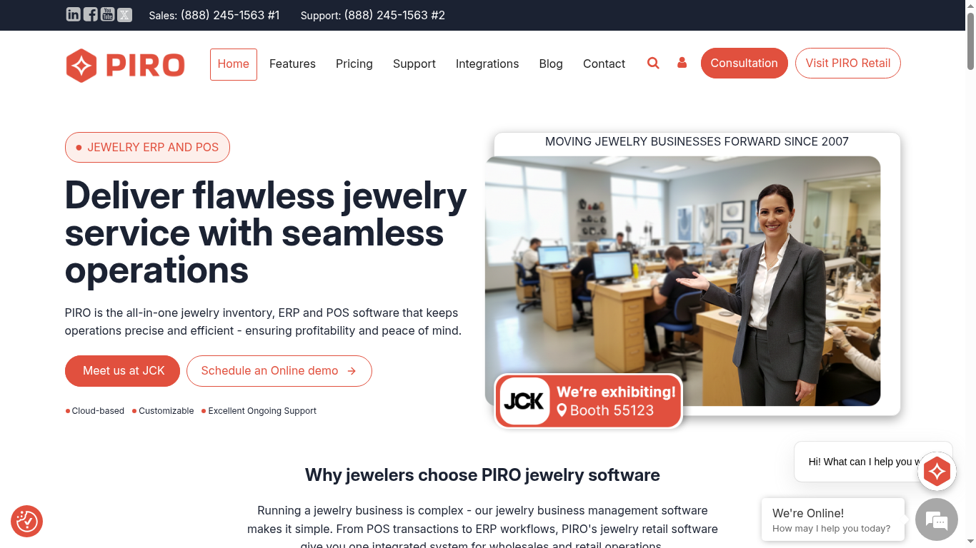
A few practical applications showing how PIRO looks across marketing surfaces — from website to social, email, trade show and sales materials.
"I would highly recommend PIRO for everybody..."
We wish Vlora Jewelry continued success.
View on LinkedIn →
- Use consistent logo placement.
- Use white or clean backgrounds.
- PIRO Red as accent — not as overwhelming full background.
- Keep post headlines short and direct.
- Focus on business pain points and benefits.
- Stay professional but approachable.
The quick checklist.
- Use the current PIRO logo system.
- Use PIRO Fusion and PIRO Retail only as approved lockups.
- Use Inter.
- Use the official color palette.
- Keep enough spacing.
- Communicate benefits clearly.
- Use clean white backgrounds.
- Keep messaging direct and business-focused.
- Use old or flame-based PIRO logos.
- Use “Fusion” or “Retail” as standalone brands.
- Create standalone logos for Portal, SPIFF or other product features.
- Use Segoe UI as the main font.
- Overload designs with too much red.
- Stretch, recolor or distort any logo.
- Use technical jargon without business value.
Grab the assets.
Everything you need to apply the PIRO brand consistently — in one place.